ShopDreamUp AI ArtDreamUp

Deviation Actions


![Lightning Dust [25 min speedpaint]](https://images-wixmp-ed30a86b8c4ca887773594c2.wixmp.com/f/bfdad229-dae3-43ef-9a85-11cd8c975e4b/d5uo8cm-2eef2711-f3a7-47d7-add9-39c67bfd4156.png/v1/crop/w_92,h_92,x_3,y_0,scl_0.013142857142857,q_70,strp/lightning_dust__25_min_speedpaint__by_darkflame75_d5uo8cm-92s.jpg?token=eyJ0eXAiOiJKV1QiLCJhbGciOiJIUzI1NiJ9.eyJzdWIiOiJ1cm46YXBwOjdlMGQxODg5ODIyNjQzNzNhNWYwZDQxNWVhMGQyNmUwIiwiaXNzIjoidXJuOmFwcDo3ZTBkMTg4OTgyMjY0MzczYTVmMGQ0MTVlYTBkMjZlMCIsIm9iaiI6W1t7ImhlaWdodCI6Ijw9NzAwIiwicGF0aCI6IlwvZlwvYmZkYWQyMjktZGFlMy00M2VmLTlhODUtMTFjZDhjOTc1ZTRiXC9kNXVvOGNtLTJlZWYyNzExLWYzYTctNDdkNy1hZGQ5LTM5YzY3YmZkNDE1Ni5wbmciLCJ3aWR0aCI6Ijw9ODAwIn1dXSwiYXVkIjpbInVybjpzZXJ2aWNlOmltYWdlLm9wZXJhdGlvbnMiXX0._tM6Jt0p3UjWrT701SCYSiqIOkcx6rTq9SC3zG0FlWk)


Suggested Deviants


Suggested Collections


You Might Like…


![First Place Again [ATG 2018 D28]](https://images-wixmp-ed30a86b8c4ca887773594c2.wixmp.com/f/f1b1b37a-66d1-43a8-8a36-8db01fde03ff/dcktqkl-ed6f3f2f-f4d1-4252-b86d-ce36cfab3766.png/v1/crop/w_184,h_184,x_19,y_0,scl_0.072156862745098,q_70,strp/first_place_again__atg_2018_d28__by_vanillaghosties_dcktqkl-92s-2x.jpg?token=eyJ0eXAiOiJKV1QiLCJhbGciOiJIUzI1NiJ9.eyJzdWIiOiJ1cm46YXBwOjdlMGQxODg5ODIyNjQzNzNhNWYwZDQxNWVhMGQyNmUwIiwiaXNzIjoidXJuOmFwcDo3ZTBkMTg4OTgyMjY0MzczYTVmMGQ0MTVlYTBkMjZlMCIsIm9iaiI6W1t7ImhlaWdodCI6Ijw9NzI2IiwicGF0aCI6IlwvZlwvZjFiMWIzN2EtNjZkMS00M2E4LThhMzYtOGRiMDFmZGUwM2ZmXC9kY2t0cWtsLWVkNmYzZjJmLWY0ZDEtNDI1Mi1iODZkLWNlMzZjZmFiMzc2Ni5wbmciLCJ3aWR0aCI6Ijw9MTAyNCJ9XV0sImF1ZCI6WyJ1cm46c2VydmljZTppbWFnZS5vcGVyYXRpb25zIl19.W0bQIzR8_JlMjoX9NI2Uwy_8frYu1e-MGqbxv1tzB1Y)
![First Place Again [ATG 2018 D28]](https://images-wixmp-ed30a86b8c4ca887773594c2.wixmp.com/f/f1b1b37a-66d1-43a8-8a36-8db01fde03ff/dcktqkl-ed6f3f2f-f4d1-4252-b86d-ce36cfab3766.png/v1/crop/w_92,h_92,x_9,y_0,scl_0.036078431372549,q_70,strp/first_place_again__atg_2018_d28__by_vanillaghosties_dcktqkl-92s.jpg?token=eyJ0eXAiOiJKV1QiLCJhbGciOiJIUzI1NiJ9.eyJzdWIiOiJ1cm46YXBwOjdlMGQxODg5ODIyNjQzNzNhNWYwZDQxNWVhMGQyNmUwIiwiaXNzIjoidXJuOmFwcDo3ZTBkMTg4OTgyMjY0MzczYTVmMGQ0MTVlYTBkMjZlMCIsIm9iaiI6W1t7ImhlaWdodCI6Ijw9NzI2IiwicGF0aCI6IlwvZlwvZjFiMWIzN2EtNjZkMS00M2E4LThhMzYtOGRiMDFmZGUwM2ZmXC9kY2t0cWtsLWVkNmYzZjJmLWY0ZDEtNDI1Mi1iODZkLWNlMzZjZmFiMzc2Ni5wbmciLCJ3aWR0aCI6Ijw9MTAyNCJ9XV0sImF1ZCI6WyJ1cm46c2VydmljZTppbWFnZS5vcGVyYXRpb25zIl19.W0bQIzR8_JlMjoX9NI2Uwy_8frYu1e-MGqbxv1tzB1Y)


Featured in Groups


Description
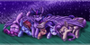
The best flyers in.... er... The best flyers in all of Equestria?
Drawfriend! #29
Image size
5100x3300px 6.75 MB
Comments33
Join the community to add your comment. Already a deviant? Log In
WTF are these options? There should be stars for technical things. Ignore the stars.
For the purpose of stars:
Vision = Composition
Composition:
Big yellow wing halts the flow from the foreground character's vision, creates a weird interrupt when scanning the piece
Nothing circles the viewer's eyes back to the upper left. Both RBD's trail and Spitfire's head guide the eyes down and to the right.
The vertical rainbow fails to block the right edge because RBD's trail overlaps it.
Lighting:
The lighting on the characters and the background come from different angles.
The shadows on the characters are more vibrant than the highlights, flattening the limbs and making it a bit chaotic to look at
Value::
The background characters are too dark, they don't appear to be in the distance as their size indicates.
RBD and her trail's contrast is too similar to the vertical rainbow. They appear to be adjacent in space and this ends up pushing the rainbow and the clouds forwards.
Derpy's anatomy is confusing because of the lighting on her pose
Technique:
Clean, deliberate shapes, and warm-light/cool-shadows adds depth
0 originality because fanart
0 impact because it lacks a compelling story or message
I love you.